


The fastest, easiest way to transform a space (and how to try it)
A thoughtfully chosen paint color can make all the difference in an otherwise simple or dull room.

I shared a Pepto Bismol-pink bedroom with my two sisters growing up. The walls were bright and rich and wild, just like the medicine, though the comparison my parents were making between the color and tummy-preserving liquid was lost on me at the time. The room had many iterations, I think purple for a while, then blue (or maybe that was the play room?) and then eventually white. My mom let us paint the walls or rearrange the furniture a surprisingly frequent number of times. It was fun and the colors were bright and kid-like and full of personality and I don’t think anything matched.
I’ve come to like bright colors on the walls in a home. It feels unexpected and daring and fun after years of leaning toward walls in simple non-colors that sort of fade away. I think I like bright colors on the wall mostly because it’s a fairly affordable way to transform a space — and you can always repaint it if you hate how it turns out.
This week, I was thinking about how magazines and curated internet collections have made even the simplest decisions, like painting a room, feel like a make-or-break situation. If the color’s wrong, it could make the whole room look off, incomplete or poorly done (or so it seems). I speak from experience when I say it because I’ve agonized over paint colors in the fear that the room won’t look right at the end. It’s a lot of pressure to put on a project that could easily be fluid, evolve over time or fixed with a quick swath of another paint color. Houses should evolve with their inhabitants. It might be a little messy, but that’s what gives it character.
Today’s newsletter is about embracing bright colors. From decorating with difficult colors to options to try when you can’t paint, incorporating bright color has major payoff. Oh, and one note: There’s something I need your help with at the end of this email. Thanks for being here.
GOING BOLD WITH BRIGHT COLORS
How and where to start if you want to paint bright walls
Waving around a deck of paint swatches usually won’t help you settle on a color for a space and there are too many ideas about “difficult” colors (those that are deemed too hard to get right or too bold for any normal person) that you often end up back at square one with the safe shades of pale blues, greens, grays or whites.
So how do you start to sort through the myriad of color options and find something bold, fun and exciting to go for? Aside from having a deep sense that a room ought to be a certain color or always dreaming of a pink living room, you need a starting point. Thankfully, there are a few ways to begin (that don’t rely only on gut instinct).
Really, it’s science.
Light and direction
Nothing affects how a color reads in a room more than the light that it gets, both the amount of light and the tone of it. Open your phone’s compass app and stand facing the windows in your room. (If you have windows on multiple sides of the space, choose the largest windows.) Take note of the directions the compass reads because, lucky for you, there are a few general principles about how the light looks different depending on the direction.
North: Northern rooms tend to have a cool, blue cast of light and tend to get the least amount of light. To balance out the cool light and avoid a sad, gray feel, you’ll want to choose colors with a warmer, yellow base that reflects the light. This could be peachy pinks, bright yellows, or yellow-based whites. But if those aren’t your preference, lean into the cool, darker nature of the space and choose a dark color for the walls like a blue or dark gray.
South: Southern rooms, on the other hand, get warm, bright, sunny light throughout the day. With so much bright light in the space, you have options. You could choose a pale, cool color to balance out the warmth and make it feel peaceful and simple or go for a warm color (orange, yellow, pink, etc.) to play up the warmth of the space.
East: Eastern rooms get bright, sunny mornings which then fade into lower light in the afternoons, which can create a cool cast of light in the space. Dark, rich colors can be great in east-facing bedrooms because they’ll feel cozy in the darker evenings but brighter colors with depth will ensure that the color doesn’t go sad or murky in the absence of evening light.
West: Western rooms will be darker in the morning but have a warm, orangey glow in the afternoon and, if you’re lucky, can get really beautiful rays of sunshine that stream through the space. Think about how you want the room to feel because, like south-facing rooms, these are flexible. If you want a bright, glowy feel, you might consider an orange or pink but if you want something softer, blues and greens can still be pretty — though their tone will change significantly throughout the day.
Function
I read in Bunny Williams’ book “An Affair with a House” that a decorator friend told her that kitchens should always be white — and it stuck with her, she’s always painted kitchens white since. I don’t know how I feel about that rule, but I like the concept of it: the room’s function will impact your color choice. In a kitchen where things are bound to be messy and stuff will pile up on the counters, a crisp, pretty white could feel anchoring and peaceful.

There are there are three components to a room’s function as it impacts paint color: who will be using the room, when they will be using it and what purpose the room serves. A bedroom is used by one or two people mostly in the morning or at night for smaller periods of time when when winding down, sleeping or waking up. A calming color suited to the space (like a pale blue in a south-facing bedroom or a rich blue in an east-facing bedroom) will feel soothing and anchoring. A dining room will be used by multiple people at a range of times, depending on the occasion, for a sole purpose. Bright colors can be impactful and enliven the space, making it feel more fun for occasions or glow by candlelight (if you’re fancy). See below, a rich teal blue in a dining room decorated by Carlos Sanchez-Garcia. It looks like the room might get west-facing light because of the cast, but that’s a guess.

As for spaces that are used very little, but still need to be thought of, I say go big or go home. Do a bright color in a dark hallway, make a powder bathroom or guest bathroom a flattering, rosy hue or paint the laundry room red.
Feel
If all else is lost and this has gotten you nowhere closer to choosing a color, then it’s time to consult the design books or Pinterest. Spend time looking for rooms you love and see which colors they use — the colors will speak to you. (I know that’s not very practical, but it’s true).
What to do next
Once you’ve chosen the neighborhood of colors you want to be in, select a handful of shades and test them in your space (on multiple walls!) for a few days. If you don’t want to paint the walls, you can paint poster board or plywood scraps or cardboard and move them around. You may be surprised how the light in the room changes the shade of the color. If it washes out, try something darker. If it turns sour, try a cooler tone. If it goes gray, try something warmer.
After you’ve settled on a paint, determine a trim color, if you have trim to paint. Most paint shops will recommend a coordinating white (or other colors) that work well with the shade.
SHE’S A RAINBOW
Collections of pretty color combinations

An embroidered piece from India, made circa 1700, from the Victoria and Albert Museum.
“Still Life: Bouquet and Compotier” by Henri Matisse from the collection of the Dallas Museum of Art.
American quilt, circa 1856, made in Michigan by multiple quilt makers.
The home of Christophe Gollut in Gran Canaria Spain, photographed by Mark Luscombe-Whyte for Cabana Magazine. See more of the house.
Large French Majolica shell plate Sarreguemines, circa 1920.
NO PAINT NEEDED
Colorful, large-scale art to add color

Spare the paintbrush and hang up some art instead: A denim-blue silk suzani could add a pop of color hung up behind a bed, a vintage Vogue cover is a perfect poster-style piece and, if you can make the investment, there’s nothing more timeless than a panel of Gracie wallpaper.
VARIATIONS ON A THEME
Rooms that go big on one color
It’s counterintuitive but I think if you are fearful about incorporating bright colors into a design scheme one of the best things you can do is a monochrome room — or a room with a single-color theme. The similar tones throughout the room can create a simple, easy, comfortable look that I think people often worry will be lacking if they incorporate pops of bright color at home.
Here are some examples of rooms where single-color schemes don’t feel jarring and instead feel just right.

A lovely yellow bedroom with a canopy bed. It might be the glow of the light, but the ceiling looks yellow, too.

I’ve shared this blue bedroom by David Hicks before, but it’s too good not to repeat. Everything is done up in an aqua blue (and another canopy bed makes an appearance). Wouldn’t it feel so cozy to be wrapped up in that cool, soothing color?

Here’s a raspberry red hallway for you with bright walls, matching curtains, lampshades that coordinate and a peek of a seat cushion that has a berry pink tone to it. The photos are of a home in Milan.

Enrica Stabile, an interior designer and antique dealer, has a candy-colored home in Milan where she uses the palest, prettiest tones. This sweet, delicate pink could feel childish or like it belongs in a nursery, but the way she incorporates the color in all sorts of elements (pottery on the wall, lampshades, curtain, cushions, linens) makes it look so thoughtful.
GOOD CHOICE
Give it a minute
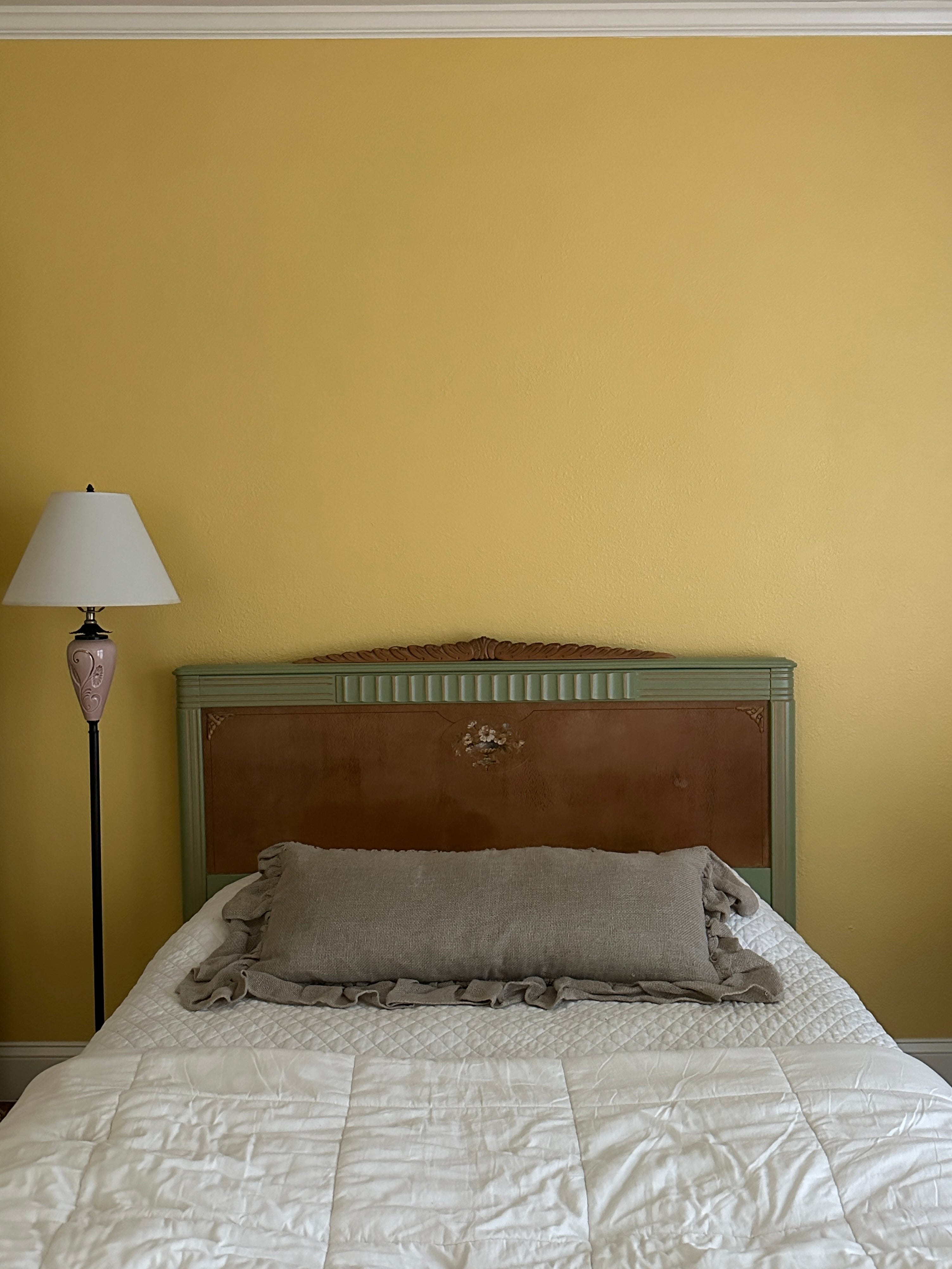
On a whim last Sunday night, I decided to paint our guest bedroom the color of a lemon meringue pie. And I immediately hated it. For the next few days, I obsessed over finding a paler yellow to “fix” the room.
But then it grew on me.
The whole, manic process reminded me that any significant change in a space takes time to settle — and it’ll take you time to settle in, too.
All the best,
Mary Grace
I’d love to grow this newsletter and I need your help. Would you consider taking 3 minutes to fill out the reader survey below? Tell me what you’d like to see more of in Choosy. Thank you!