


Is orange the best pop of color right now?
Talking citrus hues, when bright color works in design, bursts of orange and a finally-framed set of paintings

Choosing your favorites is one of those things that feels really important when you’re a child. I remember how critical it seemed to select a favorite and least-favorite color. For me, blue and orange.
You never really phase out of defining yourself by the things you do or don’t like; it’s how your life shapes up. You build friendships, pick neighborhoods to live in, spend your time, pursue a career and so on all based on an index of preferences. I like how there’s that consistency from childhood to adulthood: there are just some universal truths about life and about how you see the world.
I’ve been wondering how much choice we have in changing our perspectives, habits and even preferences. People always say that the older you get, you become more set in your ways — and I feel that. I feel a little bit grumpy when things don’t go according to my expectation or my idea of what would be best. I like things to be how I like them to be. Many of my patterns are the same as they’ve been since childhood: I’m cautious, I don’t tolerate loud noises well, I like things to be tidy and it frustrates me when they’re not, I’m not predisposed toward spontaneity and I much prefer structure and consistency and so on.
Can you really work on yourself or are you more or less set as the person you will be from birth? I wonder if we just build up a tolerance for dealing with things we dislike or, instead, if it’s that we learn to tap into some hidden strength we didn’t realize we had. Perhaps it’s both.
Today’s newsletter was inspired by the color orange, which I have felt drawn to over the last few weeks (much to my surprise as I called it my least favorite color as a child). We’ll talk balancing bright color in design, orange-hued rooms and plenty of vibrant inspiration.
BALANCING BRIGHT HUES
How vibrant color and strong structure work together
Somehow I’ve become one of those people who has a closet full of black clothes. I’ve always liked color so I’m not sure how this happened. It’s tricky to get color right — whether you’re wearing it or choosing it for the rooms in your home — I think this is why so many houses went to all-white interiors and so many closets tend to all-black outfits.
I think what we are looking for, ultimately, in paring down color is not that we all love neutrals but more so that we want a sense of calm. We want a sense of rightness, that exhale that you feel when things sit together nicely. We want things to shine and not be overtaken by a bright hue. When I wear a great outfit, I don’t want people to see the color of it first, I want them to see me. The same goes for a room: I don’t want the wall color to be what stands out, I want it to be a larger part of the whole equation that makes the room feel inviting, comfortable and complete.
So here’s a working theory that I’m testing out about how to balance vibrant color and achieve that feeling of rightness: vibrant color used within clear, structured confines creates that balance of brightness and serenity. I have a few examples for you, first in design.
There are a few designers and decorators who use color in this balanced way I’ve come to like and I think the key is that, again, it’s paired with structure. The example below, a castle in Scotland designed by Ben Pentreath, has the most vibrant green color on the walls. What I notice, though, is that the color is used in a space where symmetry and structure contain it — it’s balanced by the collection of arches and millwork that shape the room so it’s not simply a mass of green color. (See the rest of the castle on his website.)

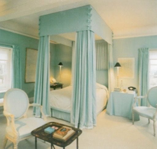
Here’s another example: a blue bedroom by David Hicks. Everything in this room is upholstered in this same shade of robin’s egg blue but there’s clear structure to it.

Here’s another angle of the room. See how the molding and ceiling detail encapsulate the color and the white floor (probably carpet) frames it on the bottom end? Then, also, the bed has clear lines, the skirted table to the right, the chairs, the curtains. Everything is framed.
Okay, on to clothes because I see the same thing happening there. I just rewatched Audrey Hepburn and Cary Grant in “Charade,” which is a longtime favorite. It’s a movie where Audrey wears lots of bright, primary colors that feel very 1960s. The clothes have such structure. Here’s a snapshot I took while watching the film a few weeks ago.
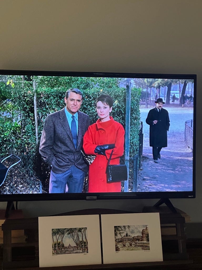
The thick collar, the seams of the portion around the buttons (I’m sure that has a name but I don’t know what it is). And it’s all framed by her black bag, gloves and dark hair. Hubert de Givenchy designed the clothes for the film.

For most of the film “North by Northwest,” Eva Marie Saint wears black or white, but in one scene, she has on an orange set: a coat and shawl, which she eventually sheds while scaling Mount Rushmore with Cary Grant, and then a simple, belted dress beneath it in the same color. It’s bright and vibrant but the tailored lines frame it and it doesn’t overwhelm her.
Perhaps all of this goes to show that the frame — frame of a room, frame of a person wearing the clothes — can shape how you choose and use color.
ZING! WENT THE STRINGS OF MY HEART
Sweet and sour inspiration

Carolina Irving’s Trebizond fabric in citrine.
“Oranges in Hooped Basket” by Jose Escofet, c. 1992.
A Greek intaglio depicting the head of Medusa carved into a carnelian stone from the 3rd-1st century BCE (The Metropolitan Museum).
An orange book cover from the 19th century from The Met Museum’s collection.
The cover of “Songs of Innocence and of Experience: Shewing the Two Contrary States of the Human Soul” by William Blake, c. 1825, from The Met Museum’s collection. This is an etching that uses orange and brown ink and was also hand-colored with watercolor. The poetry was originally produced as books, which Blake engraved, printed and colored himself.
“Toile de Nantes” fabric by Pierre Frey in sanguine.
Lee Radziwill photographed by Mark Shaw in the 1960s.
Neoclassical style creamware dishes by Wedgwood circa 1780.
Annette de la Renta’s bathroom in her and Oscar de la Renta’s Connecticut country home. The room was decorated by Vivien Greenock. (Photos by François Halard for Vogue, 2008)
ORANGE WALLS
Would you go for an orange room?
I’ve been intrigued by orange rooms, lately — and not subtle orange but really bright, shocking shades of citrus. They have a cheery feel without a saccharine look that I think often accompanies other bright colors, like yellows, pinks and apple greens.
Since we painted our bedroom a bright, rich shade of blue last year, I have marveled at how impactful the color has been. Somehow, it seems to fill the room. Even though the walls aren’t full of art or covered with furniture, I think it’s the depth of the color that makes it feel calming, inviting and like you are enveloped in a cozy space. I see the same effect in these orange rooms. The color wraps you up and feels rich and deep and substantive.
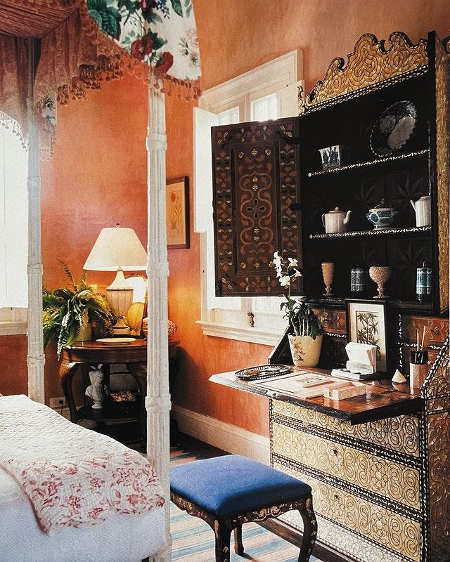
Here is an orange room at Oscar de la Renta’s home in Punta Cana, Dominican Republic.
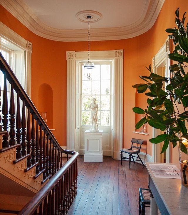
The Gatewood House in Charleston, which was restored by Gil Schafer of Schafer Buccellato Architects, has a vibrant orange color in this space. I think the color is a bit softer in real life and slightly less like a neon highlighter, though still a rich orange. Schafer recently released a wonderful PBS segment that discusses his architectural work and I enjoyed learning how he marries historic preservation with contemporary sensibility.

I cannot find where this room is located, but I love the bright orange and the way the white stripe runs all the way across the door, too, making the doorway blend into the wall.
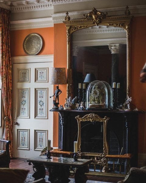
This incredible space at Ballyvolane House in Ireland is another wonderful example. I’ve included another image of the room, from a different angle, below.

I’m surprised how, even in low lighting, the room glows. I figured that orange might be one of those colors that wouldn’t read as well if the room wasn’t full of bright light — but I was wrong.
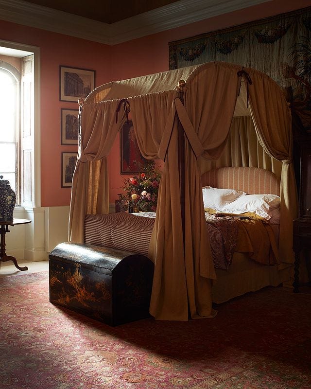
A softer, peachier example but orange nonetheless. How pretty is this room by Max Rollitt? I like how the bed and rug seem to have adjacent shades of orange, making the room feel like you’re wrapped up in it.
What do you think? Would you go for an orange room? I’m tempted.
WHEN LIFE HANDS YOU … ORANGES?
Small bursts of surprising color
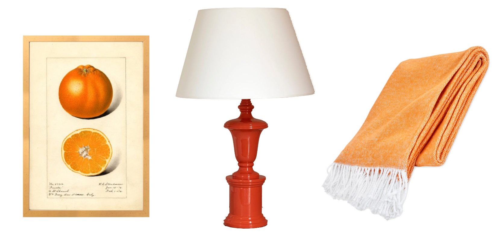
Add a pop of citrus to a space with this orange print art, an orange-colored lacquer lamp and a pretty throw in tangerine.
GOOD CHOICE
Finally framing a favorite print
Last year during a trip to Italy, I purchased a few watercolor paintings from an old man who was selling his work in a park. The park, an orange garden atop the Aventine Hill, is one of my favorite places in the world and the memory is so special to me.
The paintings have been leaning up on my desk, dresser or bookshelf for more than a a year but I finally got them framed two weeks ago at a local shop. The owner helped me sort through premade frames and custom options to find the best fit. I chose a champagne-colored frame with a pretty orange trim on the inner edges which was custom cut. The images came with mats signed by the artist, so the framer cleaned the scuffs off of them and laid museum glass over it.
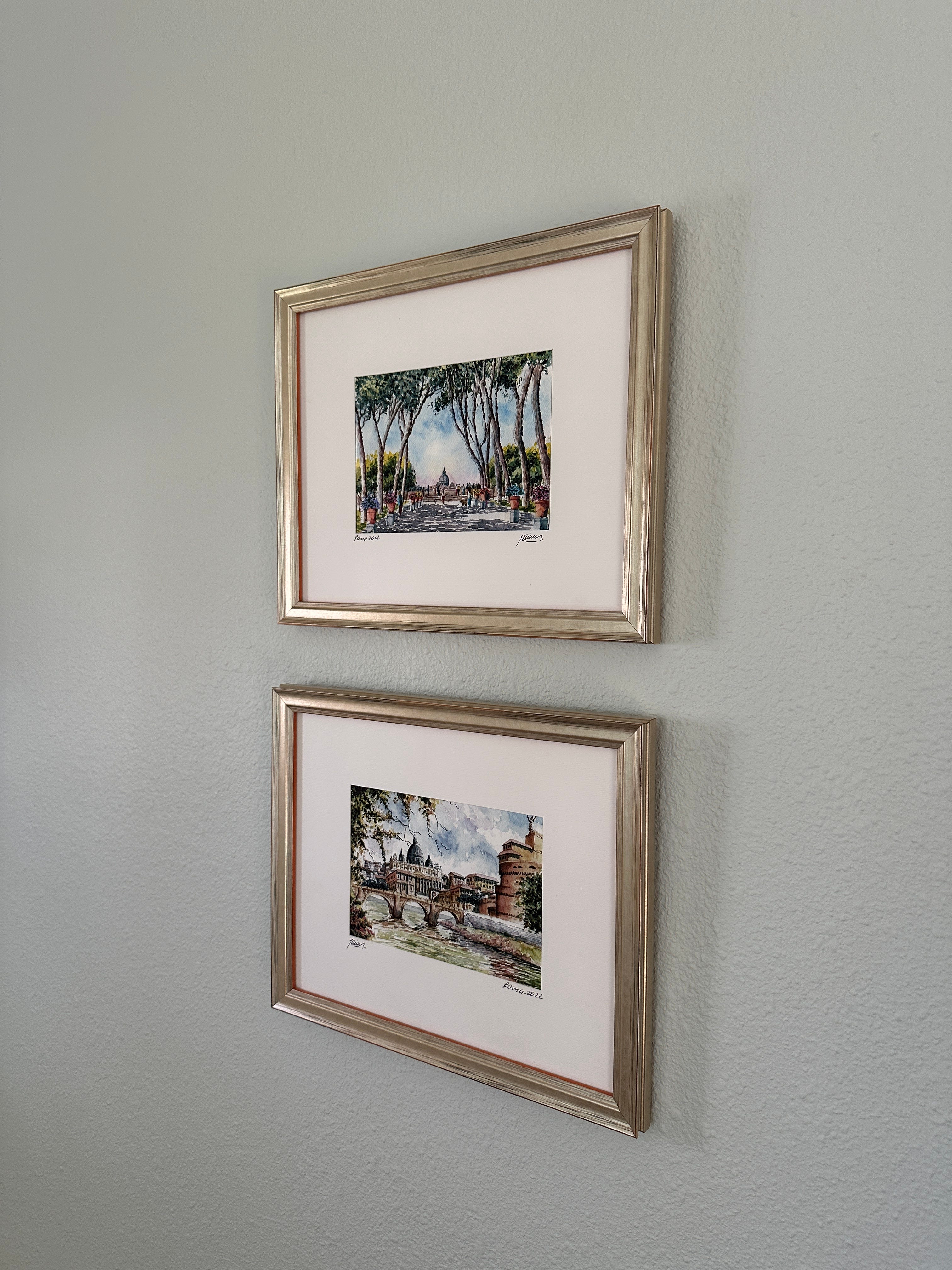
The top painting shows the park where I purchased the paintings. Isn’t it a dream?
All the best,
Mary Grace